Contractor Dashboard Re-design
Challenges
Usability issues: The existing dashboard layout was cluttered and unintuitive, making it difficult for users to find and interpret information.
Lack of customization: Contractors and clients expressed frustration with the limited ability to personalize the dashboard according to their preferences and workflows.
Data overload: The abundance of data presented on the dashboard overwhelmed users, leading to information fatigue and reduced usability.
Implementation
User Research and Analysis: Conducted user interviews, surveys, and usability testing to gather insights into user pain points and preferences.
Wireframing and Prototyping: Developed wireframes and interactive prototypes in Figma to explore potential design solutions and gather feedback from stakeholders and end-users. Regularly presented the early concepts and ideas to the team for their feedback and input.
Iterative Design Process: Iteratively refined the design based on user feedback, focusing on improving layout, navigation, and visual hierarchy.
Development and Implementation: Worked closely with development teams to implement the redesigned dashboard, ensuring seamless integration and functionality.
User Testing and Feedback: Collaborated with the Product Owner and Lead Front Engineer and together we conducted extensive user testing using Teams to validate the effectiveness of the redesign and gathered further feedback for iteration.
Results
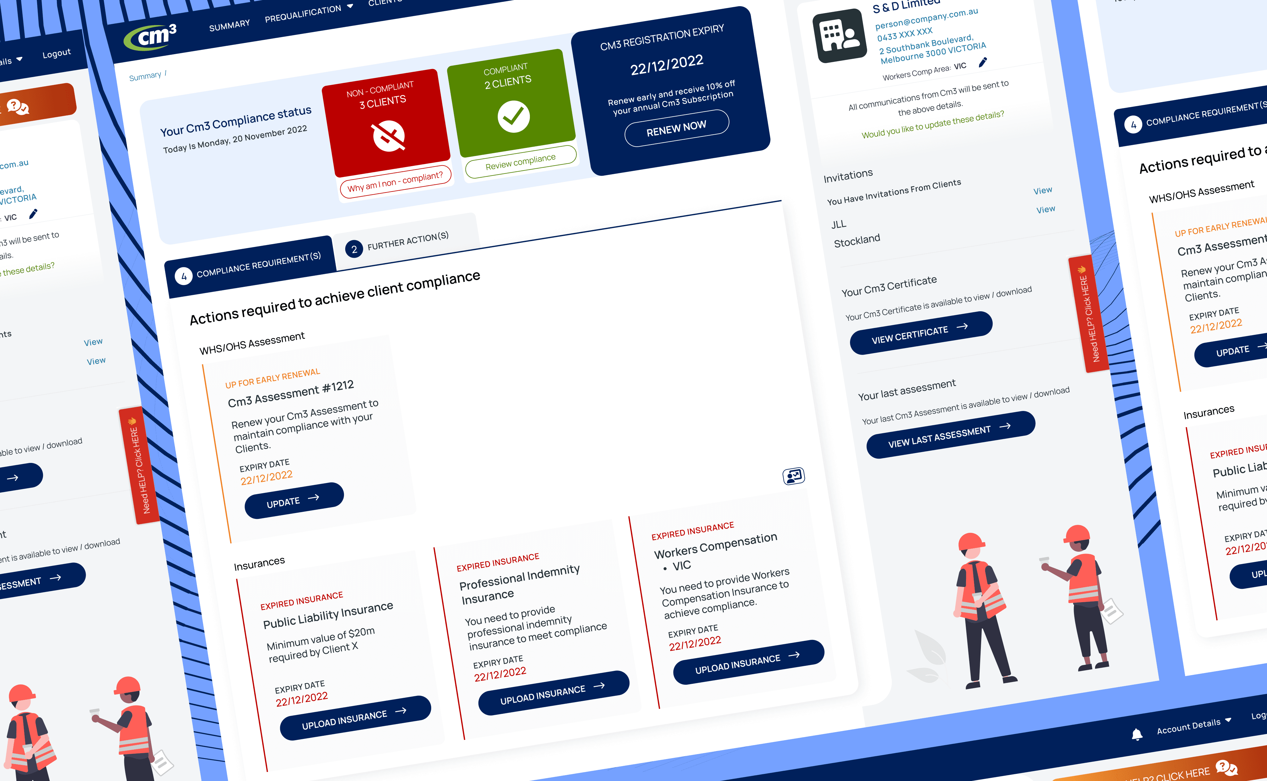
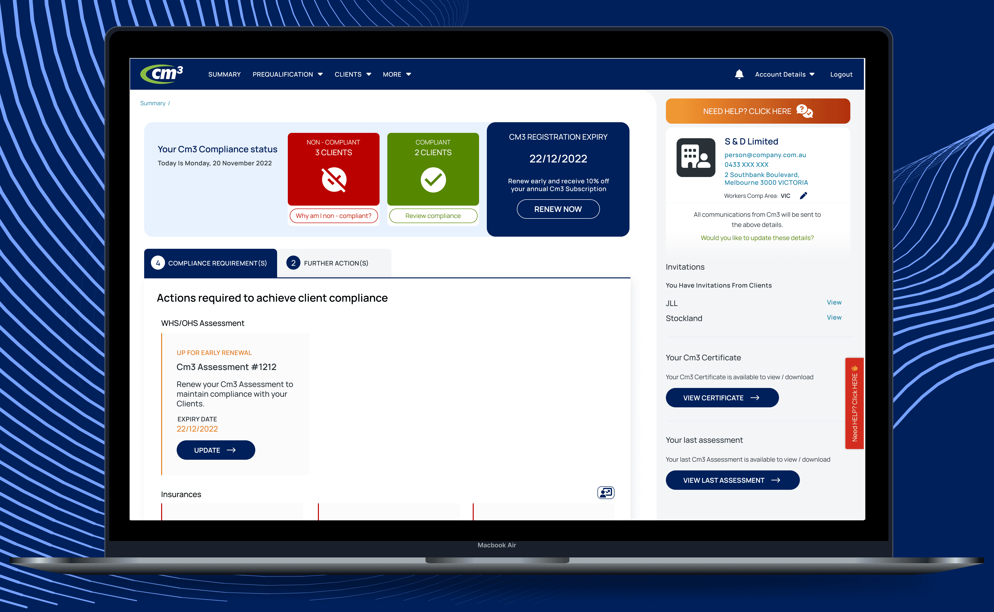
Enhanced Usability: The redesigned dashboard was well received by stakeholders and contractors and received positive feedback, with significant improvements in navigation and comprehension.

Creation of Dedicated Spaces: Introduction of customizable sections empowered users to personalize their dashboard experience, leading to greater satisfaction and engagement.

Improved Data Presentation: Streamlined data visualization and prioritization improved the clarity and relevance of information presented, facilitating quicker decision-making.

Task Management: The contractors could now easily focus on the tasks they needed to give attention toward.

Clear Colour coded Cm3 subscription Cards made it very easy for the contractors check their status.
Conclusion
The dashboard re-design project has been instrumental in elevating the overall user experience of our platform. By prioritizing usability, customization, and data presentation, we have succeeded in creating a dashboard that meets the diverse needs of our users and drives greater satisfaction and productivity.
Next steps
Continued monitoring and gathering of user feedback to identify areas for further improvement and refinement.
Exploration of additional features and functionalities to further enhance the dashboard's capabilities and utility.
Integration of emerging technologies and design trends to ensure the dashboard remains at the forefront of innovation and user experience excellence.